I really like the top t-shirt design the most, allows more room for size adjustment.
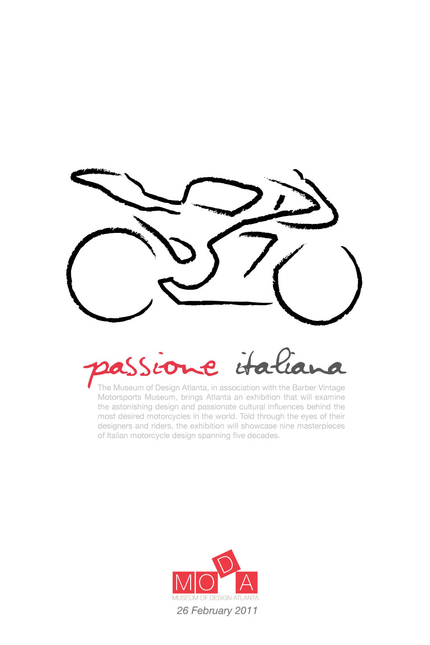
As for the date for the last poster design, I believe you can make it bigger (not too much, but enough). It'll get more attention for people to know when the event is...as well as lead them to the body copy.
My favorite t-shirt design is the top image too :) If anyone were to wear it, the type and image would be legible enough. I also love the simplicity of your overall design choice for this project.
As for posters, the first and second ones caught my eye more than the last one. I think it's all the white space. It allows your eye to rest easily on the image without being disturbed by other objects, the edge of the paper or even the surrounding type.... that's just my two cents...


I really like the top t-shirt design the most, allows more room for size adjustment.
ReplyDeleteAs for the date for the last poster design, I believe you can make it bigger (not too much, but enough). It'll get more attention for people to know when the event is...as well as lead them to the body copy.
Other than that, keep on rockin'! :)
My favorite t-shirt design is the top image too :)
ReplyDeleteIf anyone were to wear it, the type and image would be legible enough. I also love the simplicity of your overall design choice for this project.
As for posters, the first and second ones caught my eye more than the last one. I think it's all the white space. It allows your eye to rest easily on the image without being disturbed by other objects, the edge of the paper or even the surrounding type.... that's just my two cents...