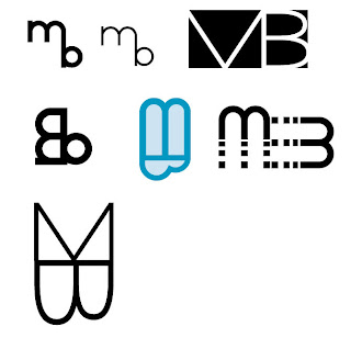
 Last semester instead of doing a personal logo, we did a logo for an eco-friendly company. Over the break I have been doing some sketches and exploring fonts and such. Any feedback or suggestions would be VERY much appreciated.
The first are just a few different ideas I was playing with and the 2nd is what I am more leaning towards.
Q: Should my full name be incorporated in my logo?
I am super excited though because I ordered my portfolio box today :)

You can have the full name there, just so that it can compliment with the logo illustration. :) I think the blue in the right bottom corner is smooth color wise in the second group of logo designs.
ReplyDeleteDon't mind me asking, but what's the concept behind the logo? Is the "m" to portray as wings?
the top is an m and the bottom is a b rotated. for my initials.
ReplyDelete